
A resume, Curriculum Vitae (CV) or bio-data is your first introduction to a prospective employer. Therefore, ensuring that you have used the best font for resume.
Because resume or other such documents catch the eye of the human resources manager or some other official, assumes special significance.
You may have that killer, job-winning resume. Unless it’s easy to read, chances are it’ll land in the nearest trashcan.
Proper presentation of educational qualifications, skills, and other important details is fine. Yet, you need to attract an employer to read them for your application to translate as an interview call.
That’s not really difficult. Use one of the best font for resume. It lends that special appeal to your application and helps you appear more professional.
The connection between Fonts & Resume
You’ll definitely question the relationship between font and resume. Therefore, I’ll try and explain.
In olden days, the common system was to send a handwritten application letter and resume.
Soon, that gave way to handwritten application with typewritten resume. The use of the best font for resume for ordinary documents came with the introduction of typewriters.
Over the years, this system further evolved to typewritten application and resume.
Usually, such applications were sent using the good old mail service.
Nowadays, most applications and resumes are sent by email. Usually, the covering letter is a standard email while the resume goes as an attachment.
And here’s where the font matters.
Importance of Email Fonts
Now here’s something to remember. Every email provider uses a default font. For example, Gmail by Google uses Sans Serif as a default font. Gmail also allows users to choose from a handful of other fonts including Georgia and Verdana.
However, you’ll never see all fonts available on any email.
Here’s why: Emails are sent across the world to and from different computers and mobile devices such as smartphones and tabs. Hence, email providers such as Gmail, Yahoo, and Hotmail use something known as ‘Web Safe Fonts’.
That’s because web safe fonts will be found on almost every device from where every email would be sent or received.
This ensures that an email can be clearly read on most computers and mobile devices around the world, without the need for the recipient to install extra fonts.
Therefore, the first rule for sending a resume is to use the default font that features on your email. You don’t need to do anything special for that. Just don’t change the font settings of your email account and you’re all set.
This ensures that your prospective employer can easily read your application letter sent by email.
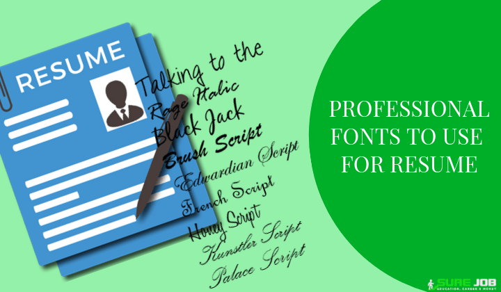
Now we come to the question about the best font for resume. There’re lots of debates over this. However, after some research and experimentation, I can safely tell you about the 10 professional fonts for resume.
Fonts for Manual, Typewritten Resume
If you’re going to use a typewriter, as they still do in some countries, you’ll most likely not have much of a choice. That’s because fonts on a typewriter aren’t changeable. In such cases, you’ll be mailing the application and resume and hence, the question of fonts doesn’t arise at all.
Of course, you can select what kind of typewriter is used- manual or electronic. Manual typewriters are almost extinct in the modern corporate world.
However, you might see some typist using them outside court complexes, government departments, and post offices. The other is electronic typewriters which are fairly fast and have a wonderful font.
Fonts for Resumes Written with Computer
Coming to the common scenario nowadays where you’ll use a computer to write your resume, here’s some important information you should have.
In all probabilities, you’ll be using a computer that has Microsoft Office and its vital component, Microsoft Word. Though you might be well versed with Microsoft Office, there’s something important you should know.
And this important information is Microsoft ClearType.
Without knowing Microsoft ClearType, it would be near impossible to learn about best and professional fonts to use for a resume.
Understanding Microsoft ClearType
In 1998, Microsoft founder, Bill Gates unveiled something known as Microsoft ClearType. Developed in-house by the company’s engineers, Microsoft ClearType was the first attempt to ensure that appearance and performance of all fonts over digital devices such as computers are not affected due to differences in software or even hardware.
Consequently, Microsoft Windows began using Microsoft ClearType fonts as default. The practice continues till today.
Microsoft embedded its ClearType fonts with all versions of Microsoft Windows, starting with Windows Vista and Office 2007 both launched the same year.
Therefore, here is the Microsoft ClearType Font Collection. These are the most professional fonts you can use for a resume.
Microsoft ClearType Collection
The Microsoft ClearType collection includes the following best font for resume. These would be available as default on most computers operating on Windows platform.
Constantia
Microsoft developed Constantia for documents published on paper as well as viewing on the electronic format on computers and TV or display screens.
Ideal for books, web design, email and magazines, this is a superb font that would lend that professional look to your resume.
Corbel
This font gives a clean and easy-to-read appearance on screen and paper. Best suited for email, web design and business documents. Corbel is also another best font for resume from the Microsoft ClearType collection for creating a professional resume.
Calibri
This font was developed for documents, web design, email, and magazines. This is one of the best font for resume.
Interestingly, Calibri font size 11 for resume is the default for all Microsoft Word documents. You can use font size 12 instead, to space out your paras and words.
Cambria
Cambria is especially for screen reading. Hence, use this font if you’re sending your resume by email. It will definitely make it much easier for your employer to go through your resume when you use this font.
It is also ideal for business documents, email as well as web design.
Candara
Microsoft describes this font is suitable for email, web design, magazines as well as informal communications. Candara is also a common font as it is part of the Microsoft ClearType Collection. Hence, you could also use Candara for your resume.
Consolas
And if you genuinely want to impress an employer by using professional font for resume, go for Consolas. In fact, it’s my favorite font for resumes and printed letters I sent by mail.
Consolas has that old world charm: it actually appears like the good old typewriter font. Your resume will get that classic look when you use Consolas.
You can check how these fonts appear and reasons why you can use them for sending resume by emails by clicking on these official sample text and description released by Microsoft.
New Times Roman
Another excellent and professional font to use for resume is New Times Roman. It mightn’t be available in the best font for resume collection on your Microsoft Word.
However, it’s always possible to download New Times Roman from the Microsoft official website itself, provided you have a legit and licensed version of Microsoft Office.
This is a very official-looking font that will give your resume a professional look.
Arial
Also among the top 10 professional fonts to use for resume is Arial. However, bear in mind that Arial is a larger font and you’ll have to choose a lower font size- 10 or so to create an excellent resume.
This font is especially useful if you’ve lots of achievements to boast on your resumes such as excellent academic qualifications and superb work experience. Arial also appears good in case you’ve to underline or use bold letters at places.
Helvetica
Helvetica, as the name suggests originates in Switzerland. It is a ‘tall’ font, meaning that alphabets tend to be a bit longer when compared over others.
If you’ll be facing a panel of interviewers while applying for a job, use Helvetica. That way, everyone around the main interviewer can read your resume.
Since this is a tallish, longer font, it can be easily read from a distance, unlike others.
Ebrima
Ebrima also comes along with Microsoft Office. It’s not a very commonly used font and hence, you mightn’t have heard of it.
A distinct advantage of Ebrima is the clarity it offers for the reader. As a slightly larger font, I recommend you opt for font size 10 if you’re writing a long resume and font size 11 for shorter ones.
Ebrima looks superb on both printed documents as well as reading on computers and mobile devices. Despite being overlooked by most people, I find Ebrima among the most professional fonts to use for resume. Check it out and you’ll understand the reasons.
Mistakes to Avoid with Fonts
Using different fonts to write a resume is a mistake that most fresher, as well as some experienced jobseekers, commit. Unwittingly of course.
One such a common blunder is to use one font for a heading such as ‘Academic Qualifications’ while using another font for describing these achievements.
This leaves a very poor impression on employers who will first judge you from your resume.
The second most common mistake is using fonts that aren’t available on the latest versions of Microsoft Office.
Consequently, your printed resume will appear outlandish. And the employer could face problems opening a resume you sent by email. In both cases, you’re the loser. Hence, it’s vital to adhere to Microsoft ClearType fonts.
Closing Thoughts
About three decades ago, when computers were rapidly taking over workplaces, a few employers had a clever trick: they would ask candidates to send in handwritten application letters.
Especially for jobs that would involve working on computers. The reason was simple. People that use a computer keyboard extensively have very different and almost illegible handwriting. Check it out yourself.
Similarly, using the wrong font on your resume does send a message to employers: that you aren’t all that familiar with working on computer screens.
If you did, you’d use a professional font for your resume. Now that you know a lot about fonts, it’s easy to avoid such blunders.
In fact, you can also create two or three different resumes using various fonts from the Microsoft ClearType collection.
That’s very simple since all you need to do is type a resume in one font, select the entire text. At a click of the mouse, the entire text will appear in another font you choose. Check it out to create that killer, job-winning resume.